As a soul designer I was responsible for project planning, research, wireframings, collaborating with the stakeholders and product owner, high fidelity prototype
Tools
Pen & Paper,
Adobe XD
Redmine,
Miro, MS Teams
Goal/Challenge
Designing a data analytics, reporting and dashboard software that enables the users to get a better control and transparency over how the unit/ward is operating and responding to the current Rauland solution platform in the hospital.
Outcomes
An improved solution with a better control which includes features –
redesigning the filter section for users to ensure more refined search
introducing a new Menu/Tab to include other services in the dashboard
adding report page so that user can view and download the report generated from the dashboard
introducing a summery section of all the selections from filtering the data to achieve better user experience
Background
Rauland is a complete technology solution provider to communicate, connect and care for acute care providers/clinicians and Aged care provider. The purpose of this analytics software is to transform clinical workflows and optimise care environments with the data to make confident decisions faster for the clinicians.
Step 1: Research & Discovery (Collecting insights)
For this project, I proceeded straight to UX/UI research. I dig deep into the existing dashboard and found out what features, information the existing dashboard included. I also investigated the interactions in the existing dashboard. Then, I collaborated with the product owners to learn about what can be supported by the existing platform to know the technical limitations and what are expectations from the business point of view.
As a part of my research, I interviewed the clinical service executive to learn about the needs and pinpoint of the users/Nurse point of view.
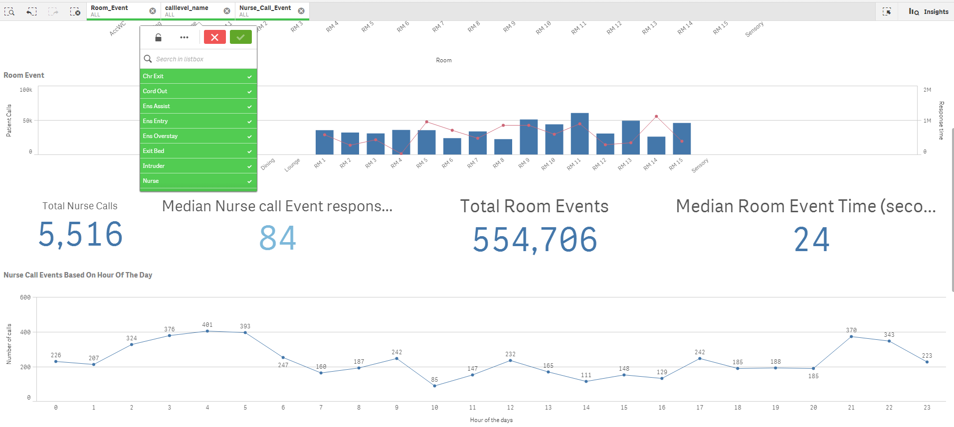
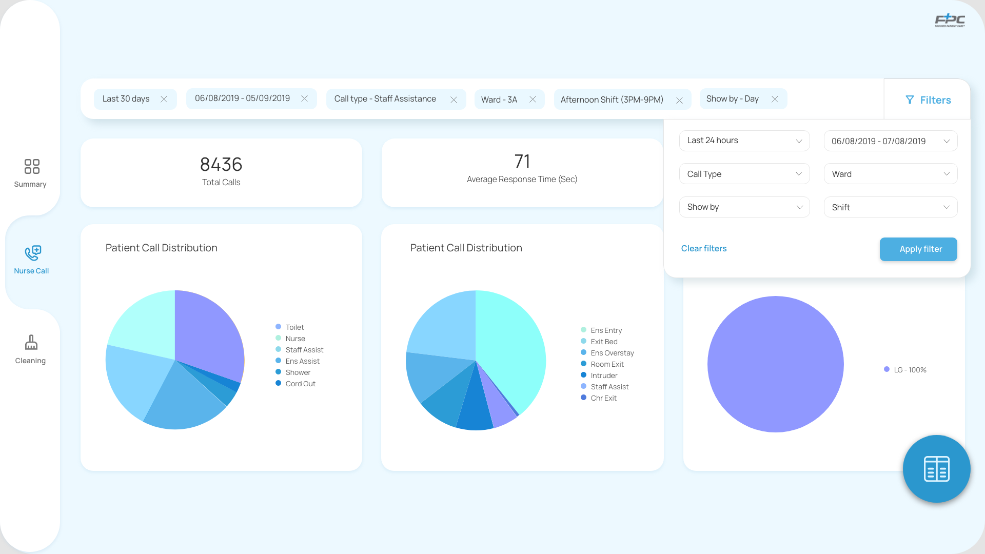
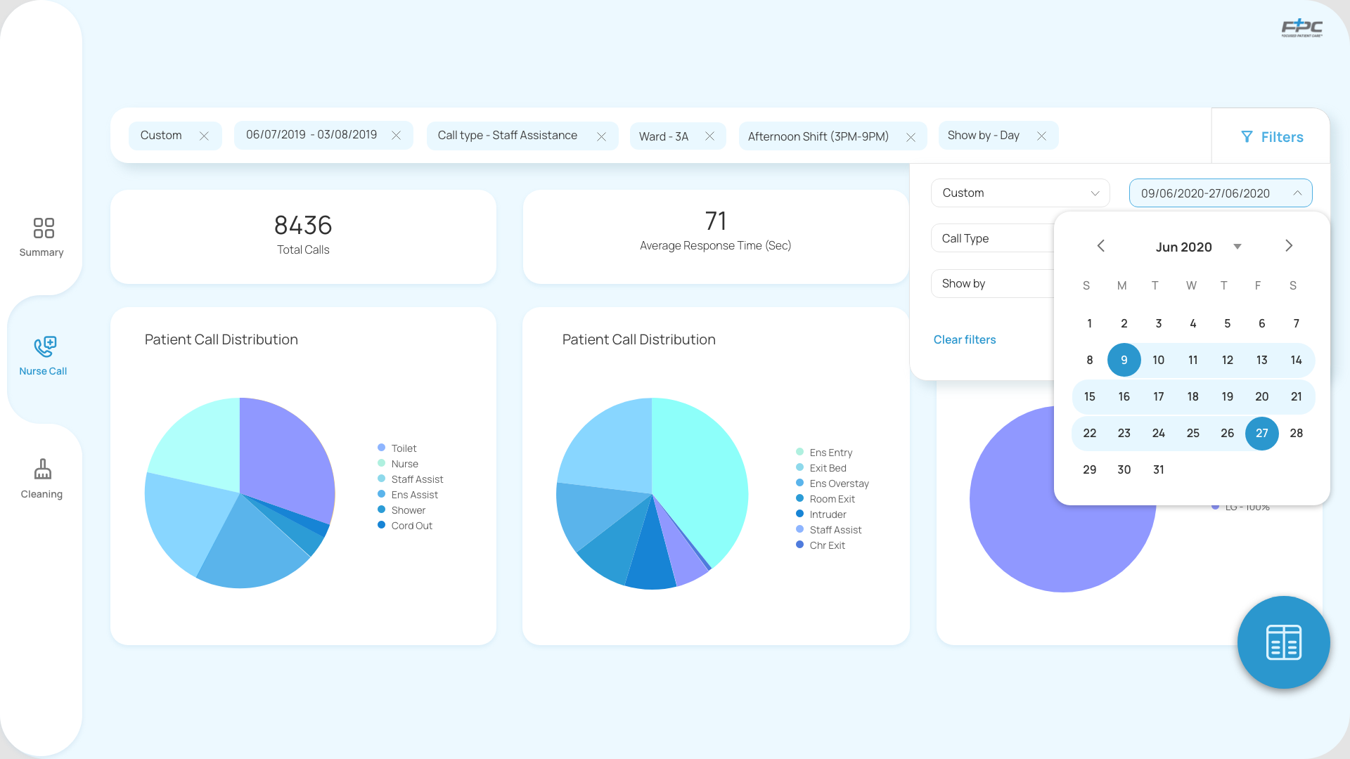
Pic: Screenshots of the past dashboard
Key findings from research
Identified more categories for filtering that would help the users to refine their search.
Filter section sticking always at the top would be beneficial to the user.
User felt that the summery of all the selections from the filter would be a great help.
User wanted to be able to generate the report from the dashboard along with a view to the graphical representation of the data
Step2: Preparing for the UI work
Mood-board of dashboard
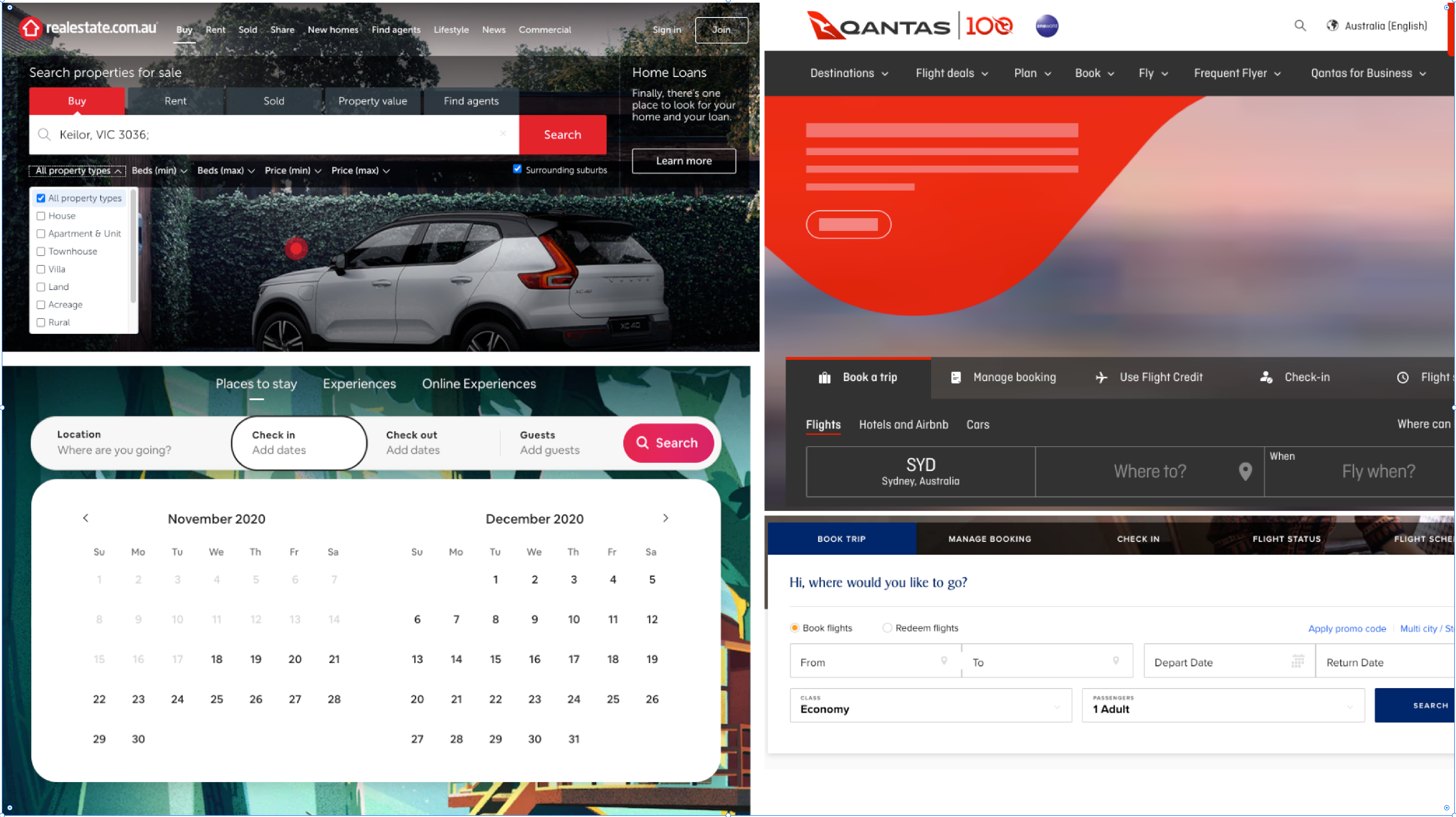
Examples of some best practice filters
I did parallel comparisons of some current dashboards and filtering systems from some exiting successful applications such as Airbnb, Realestate, Domain etc. to see how they laid out their filters. I also created a mood-board for UI design to present to the stakeholders before doing any high fidelity design.
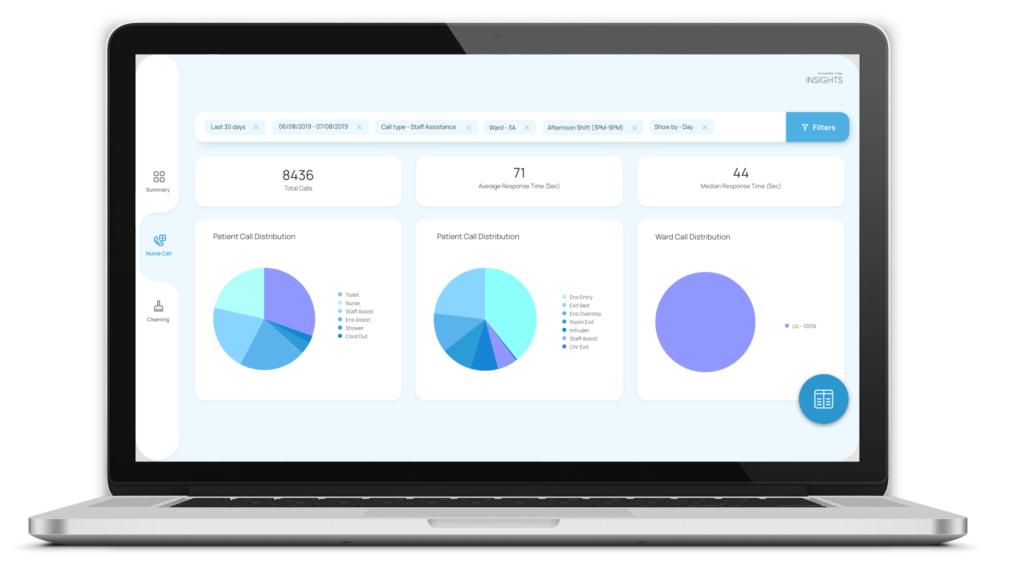
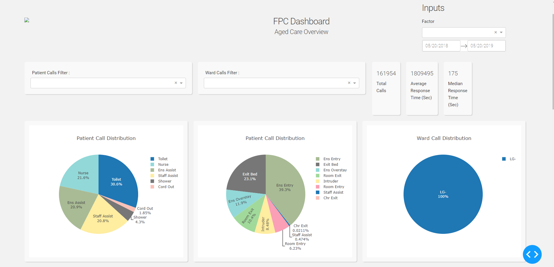
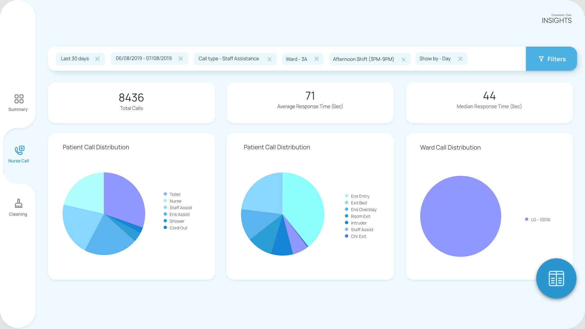
Step3: Design solution and UI mockups
I received very good feedback from the product owner and also the stakeholders for the improvements that I did on the old design without changing a lot. Because I had to be mindful about not changing a lot in the flow because the solution was already developed at the back end and the developers don’t have to spend a lot of time to do develop the new designs.
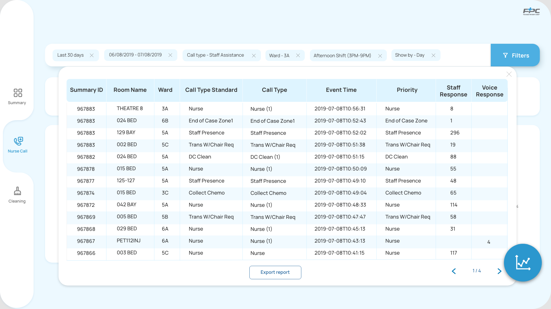
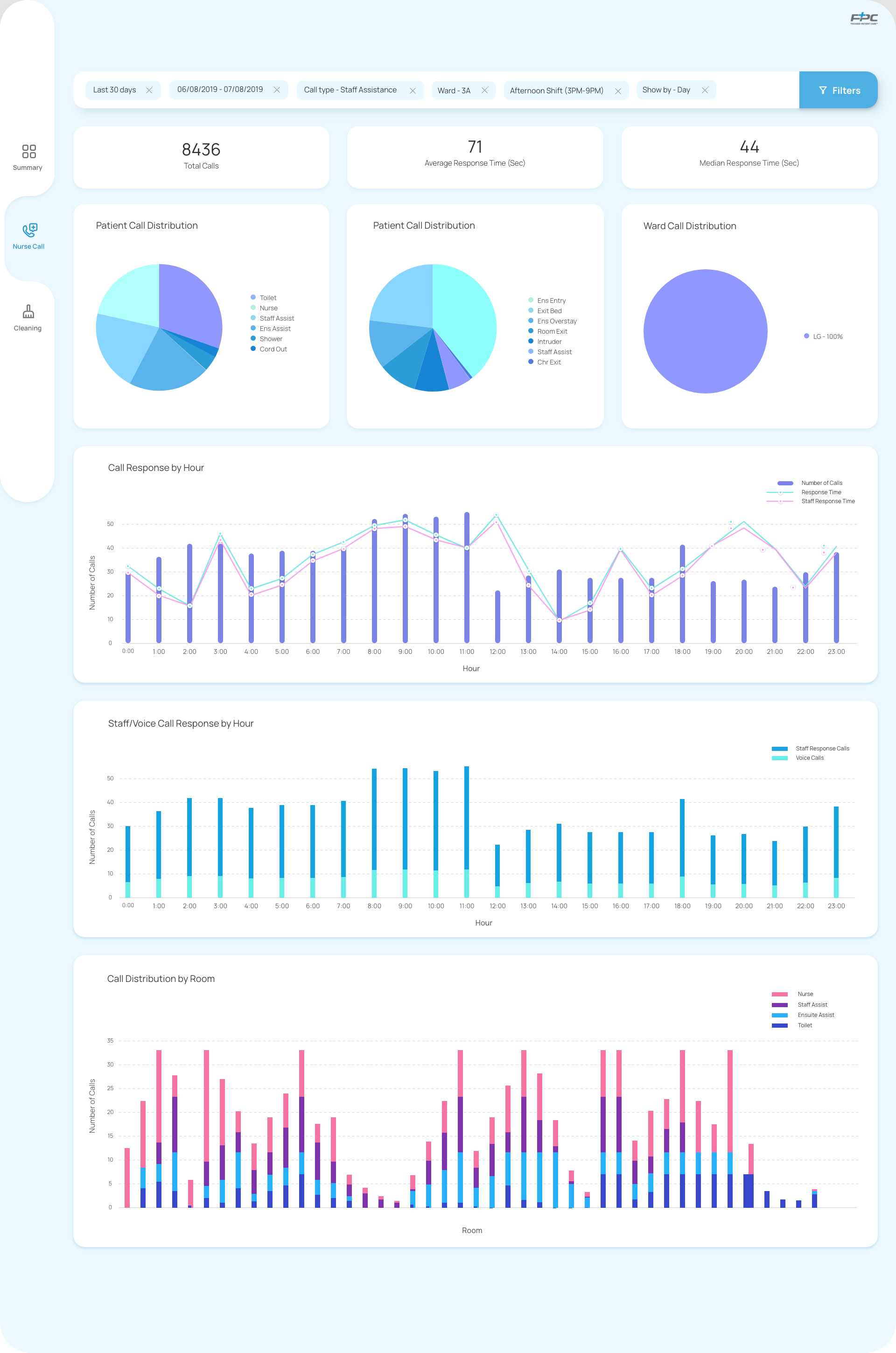
Redesigning and adding new categories in the filter section for users to allow them for more refined search
Introducing a new Menu/Tab at the left hand side to include other services in the dashboard
Introducing a summery section of all the selections from filter section to achieve better user experience
Adding report page so that the user can view and download the report generated from the dashboard using “Export report button”
Key Takeaways
Small changes can bring big differences in the product. Adding summery of the filtered selections can help the users to use the product more efficiently for a better user experience. Also introducing a new Menu/Tab at the left hand side enables other services in the dashboard to analyse real time data and enable decision makers to take critical action in areas impacting performance, safety and more – all with greater efficiency. The design needed to incorporate the current technical limitations for implementations. After collaborating with the software developers and product owners, I came to know about the development constrain of the existing dashboard and came up with a design that gives the best outcomes within the existing software architecture to meet both the user needs and business goals.
Limitations/ What is Next
The dashboard works in desktop only and was not designed for mobile platform.
The report generated in Microsoft Exel document format and there is a scope to work on the report section.