As a soul designer I was responsible for project planning, research, user flow, information architecture (IA), collaborating with the stakeholders and product owner, High fidelity UI design
Tools
Pen & Paper,
Adobe XD
Redmine,
Miro, MS Teams
Goal/Challenge
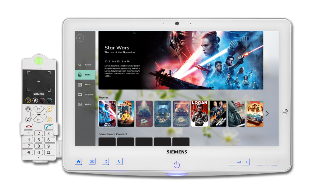
To design an online platform which enables users to enjoy any video/audio content on demand while staying at the hospital. This application is a part of Patient Entertainment System (PES) provided by Rauland as a segment of care platform for hospitals & clinicians.
The application is designed for Siemens HiMed Patient Bedside Terminal HD screen which can be operated by both the touch & handset device (screen sizes are 18 inch & 10 inch).
Outcomes
A new digital solution that enables a smooth end-to-end bedside entertainment and engagement for patients while staying at the hospital.
Rauland is a complete technology solution provider to communicate, connect and care for acute care providers / clinicians and aged care providers. One of the solutions is to provide a beautiful bedside experience which include internet connectivity, electronic meal ordering, films and television, radio, games, call and conference capabilities, direct integration with hospital systems.
The Process
Step 1: Research & Discovery (Collecting insights)
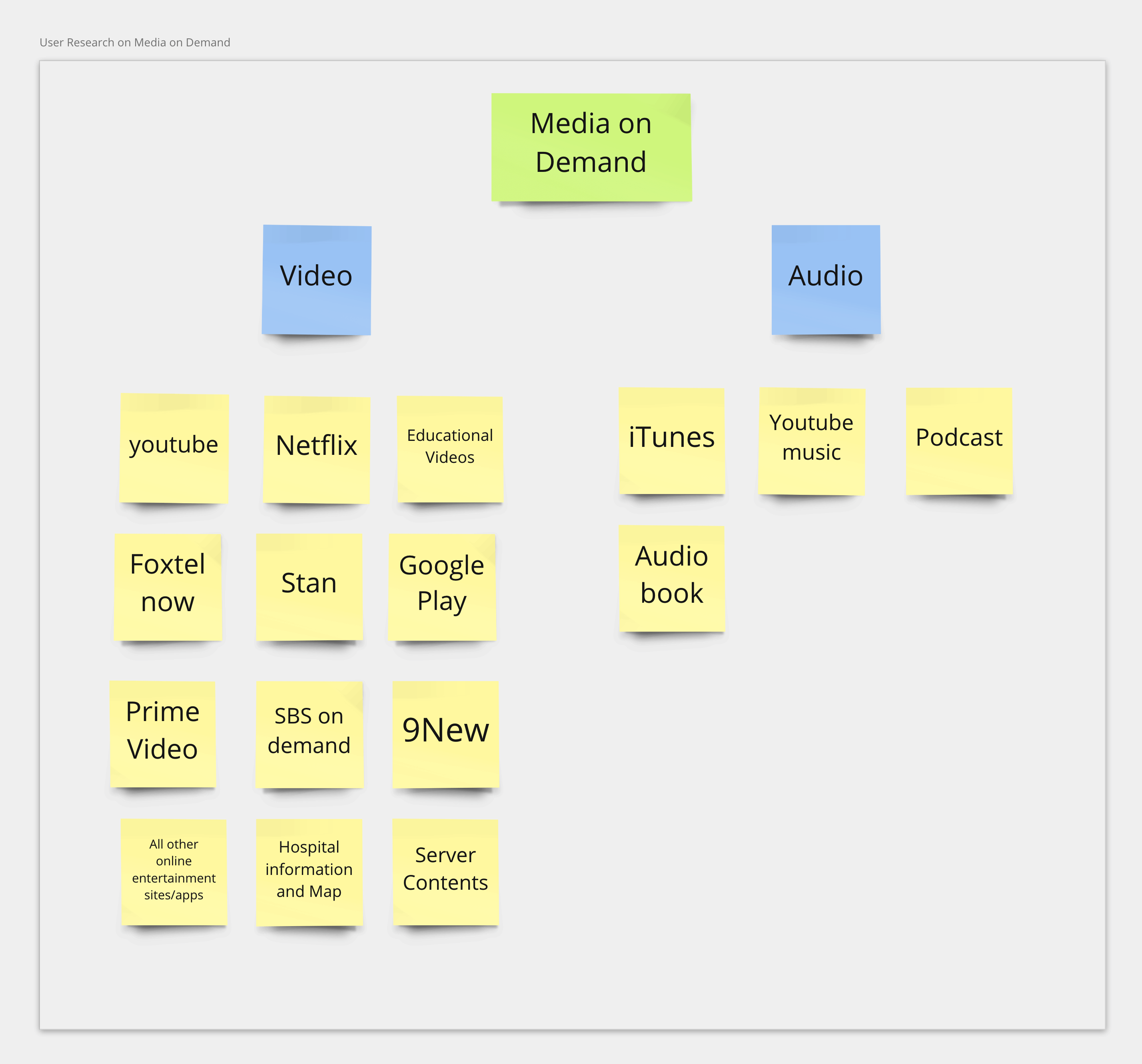
I started to find out the business goals and user types, needs and requirements. Then, I research the best practices based on the current market. Media or video on demand are one of the popular services among the users. I collaborated with the product owners to learn about limitations and expectations from the business point of view.
Key findings from research
Identified the target users and demography. Usually elderly people visits more often and the Accessibility needs to be considered carefully.
The contents needs to be presented based on each patient profiles. The profile includes information such as ethnicity, age, gender & demography.
Educational contents can be supplied to each patient. Some of the contents are generic and some can be specific to the patients’ self awareness.
The design needs to be flexible to incorporate super-text caption for hearing impaired
Target users
Elderly Patient
Middle Aged Patient.
Child Patient
Non-English Speaker
Step2: Defining the minimum viable product (MVP)
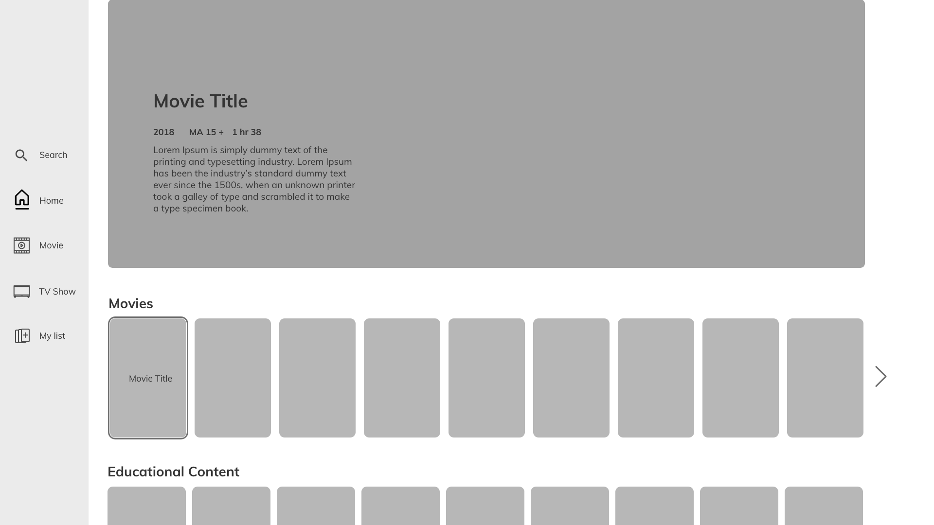
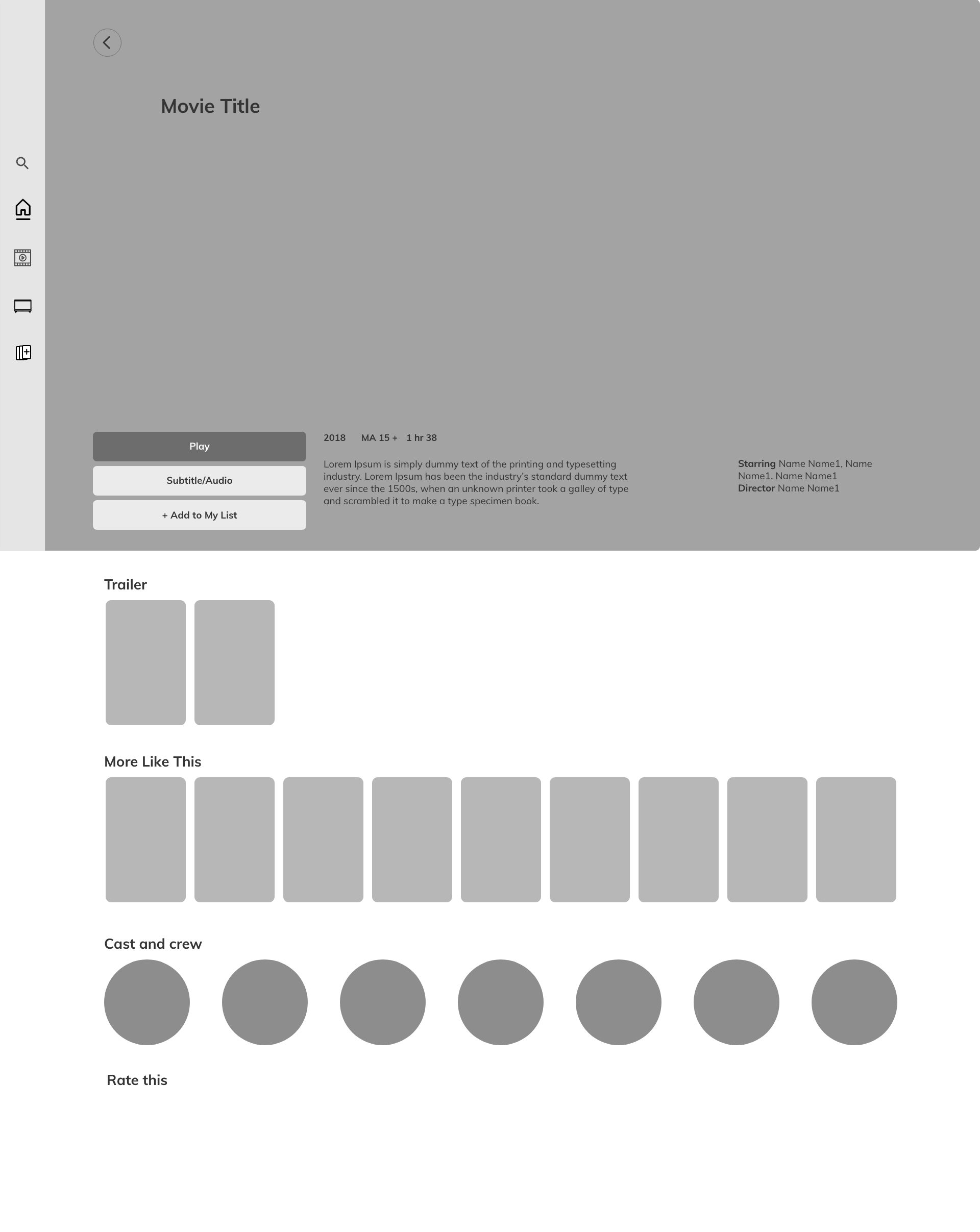
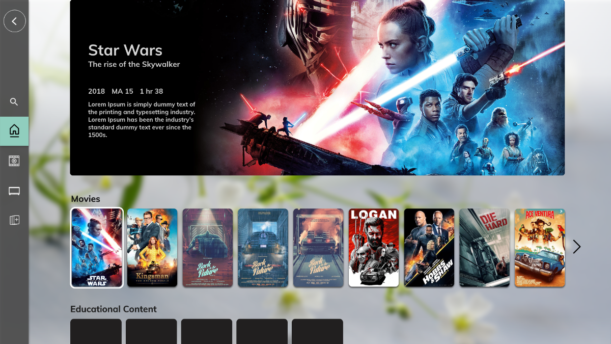
Different content categories
Search contents
Favourite list category
My list
Playlists
Summary of the contents
Times
Add to favourite
More like this
Trailer
Starring and Director information
Continue watching
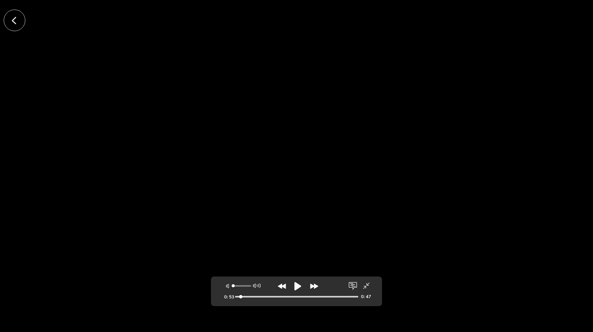
RatingsFull screen (on & off)
Subtitle (with language options)
Audio options with different languages
Forward / Resume / Backward / Play / Pause / Stop
Volume control / Mute (not-mute)
Rate this
More like this
Information Architecture
Now that features and goals were addressed with the personas in mind, I have come up with a site map to incorporate the navigation and interactions and overall architecture of the application that are required to use the app.
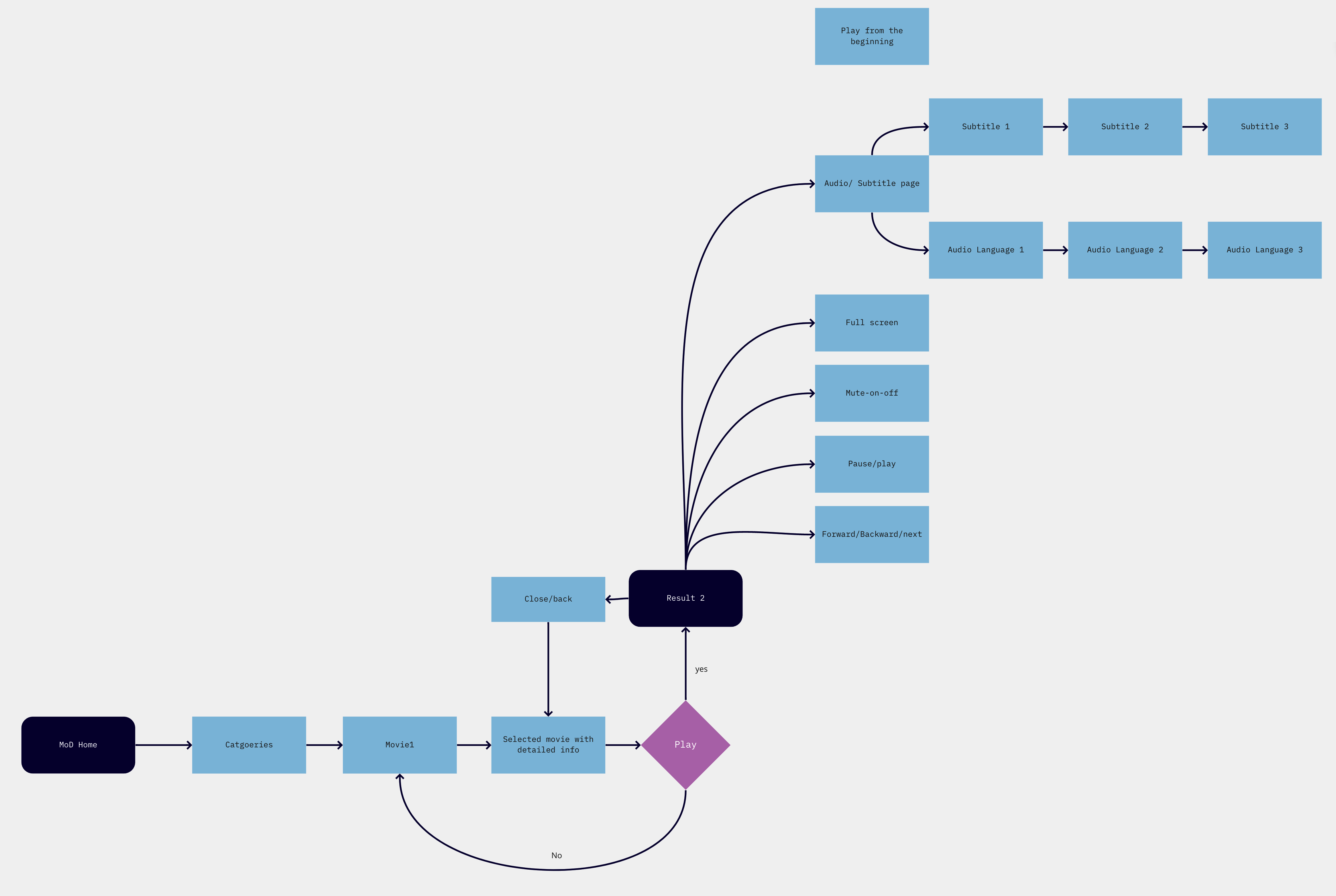
User Flow
Based on the requirements, I designed the user flow to list the logical steps and pages needed when using the app.
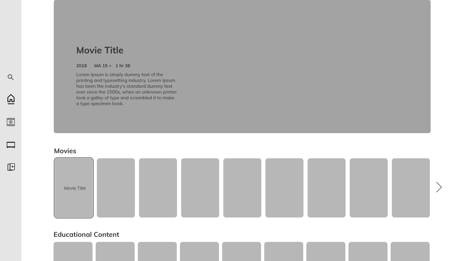
Wireframes
Based on the site map, I jumped into the XD and designed low-fi wireframes with the necessary logical steps. Then, I had a collaborative discussion session with the product owner and the internal stakeholder at this stage, where I have explained the steps and flow, reasonings logics behind the designs and features.
Step3: Design solution and UI mockups
I started working on the high fidelity UI design using the design system colours and font family of Patient Entertainment System solution. After finishing the UI, I arranged another session with the product owner and the stakeholder and received few feedbacks that we mutually agreed on. I tweaked and finally finished the design and delivered the link generated from the XD file with all the detailed specifications to the software developer.
Results
I received very good feedback from the product owner and also the internal stakeholder for the designs. The in-house product team (which I was a part of) appreciated about the link that I shared with the high-fi prototype specifications in it. This new Adobe XD feature saved not only a lot of time of mine but also the time of the software developer team.
I was mindful about the Accessibility standards as the product’s target audience varies from all types of backgrounds.
Limitations/ What is Next
The colour from the design system that I had to follow, was not very playful but the app needed to be a part of the same Patient Entertainment System (PES) family. So, I had to stick to the colour palette.
The design was completed within a tight timeframe.