Rauland

Video Nurse Call System

Project Overview

Overview

Client: Rauland
Type:  Web application
Duration: One week
Role: UX/UI Designer

My responsibilities

As a soul designer I was responsible for project planning, research,  collaborating with the stakeholders & product owner, High fidelity prototype

Tools

Pen & Paper,
Adobe XD
Redmine,
Miro, MS Teams

Goal/Challenge

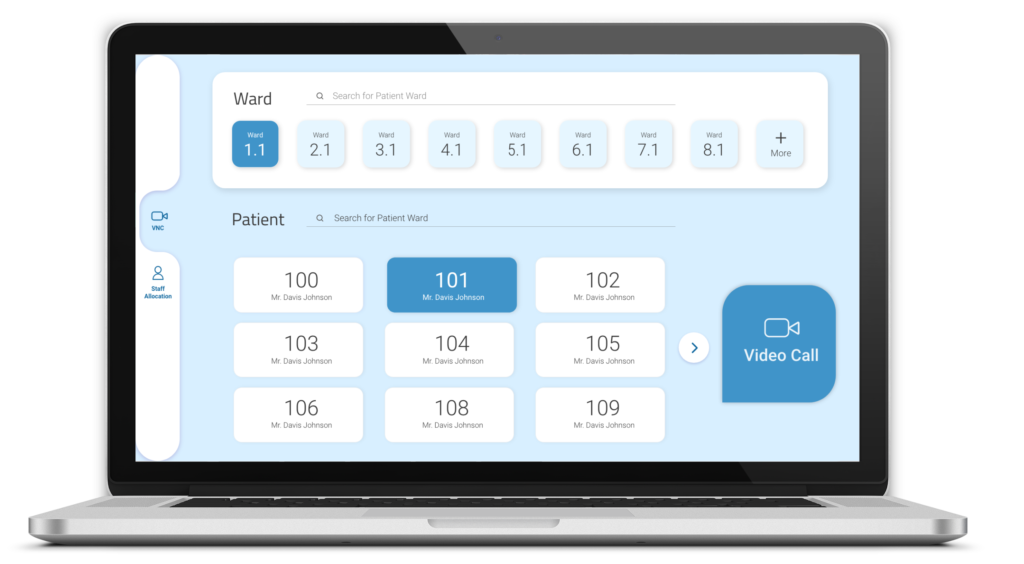
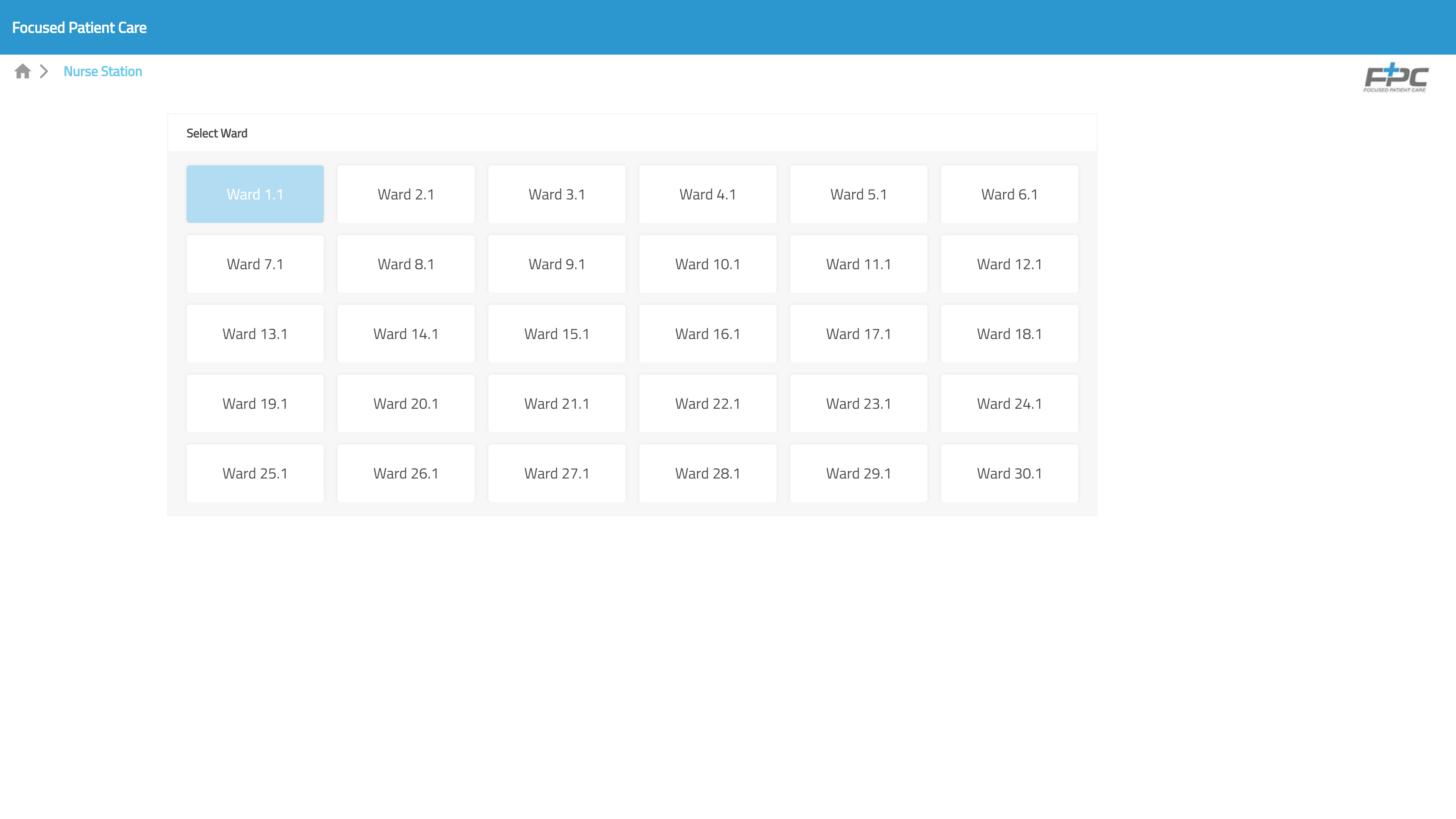
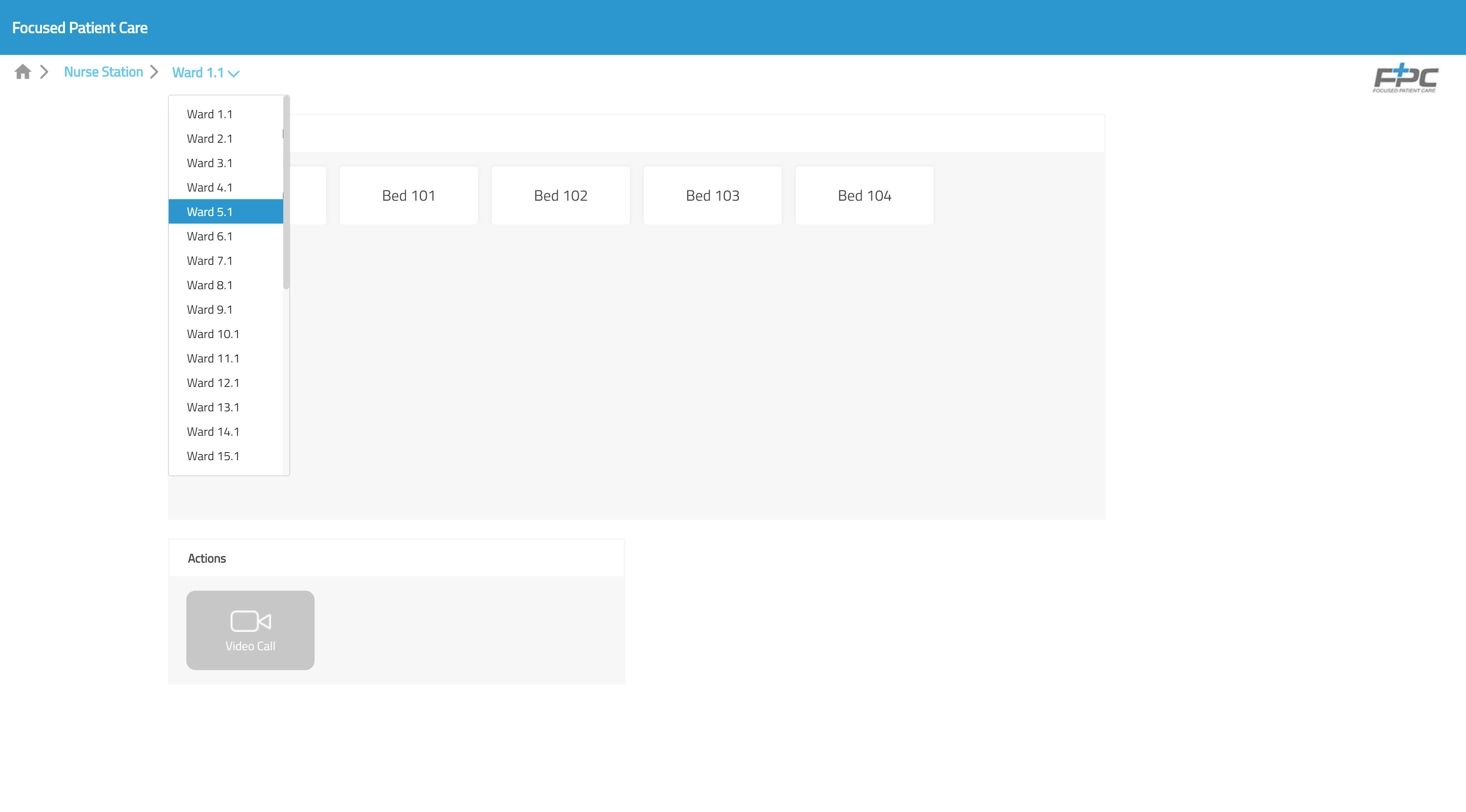
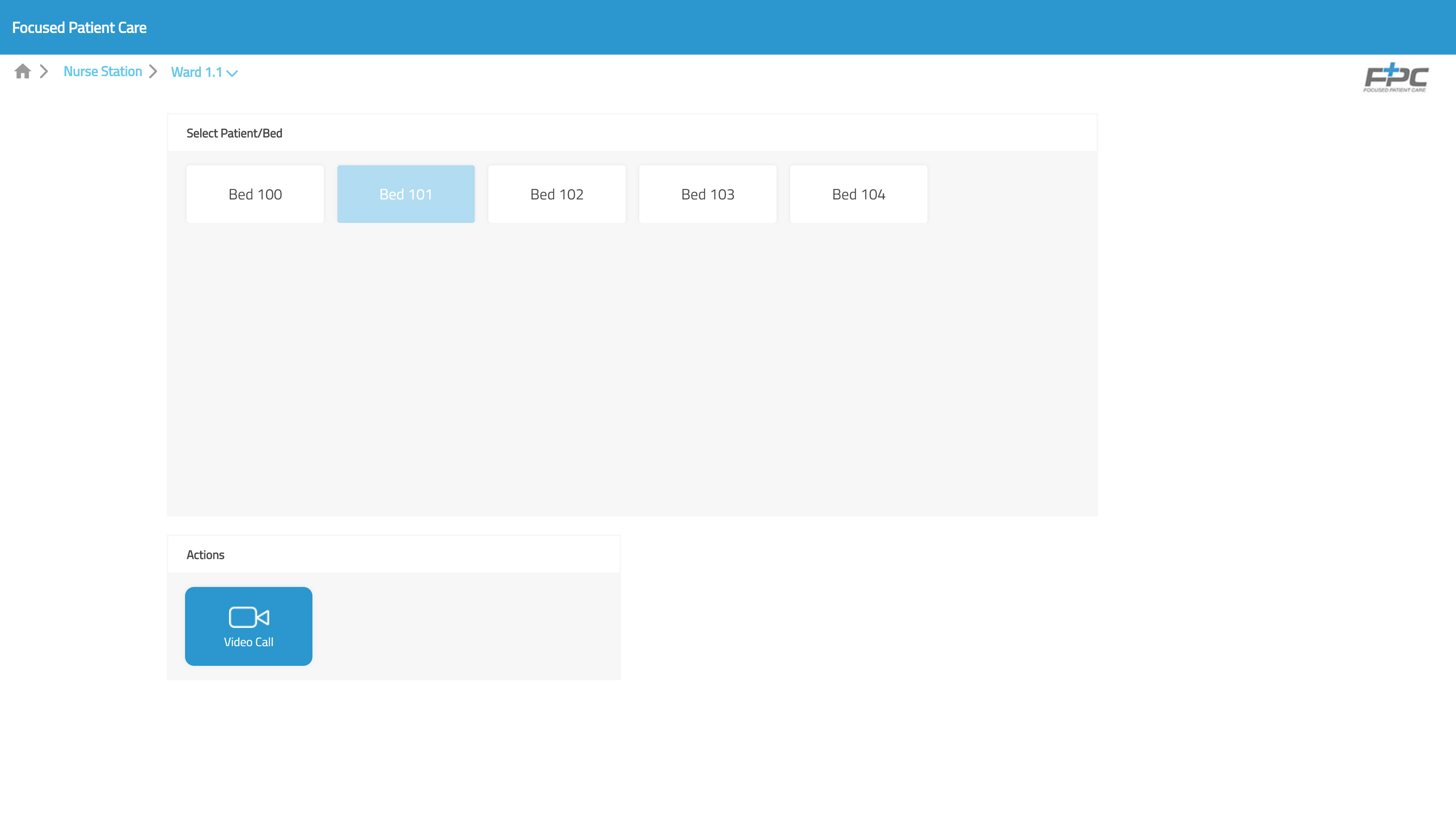
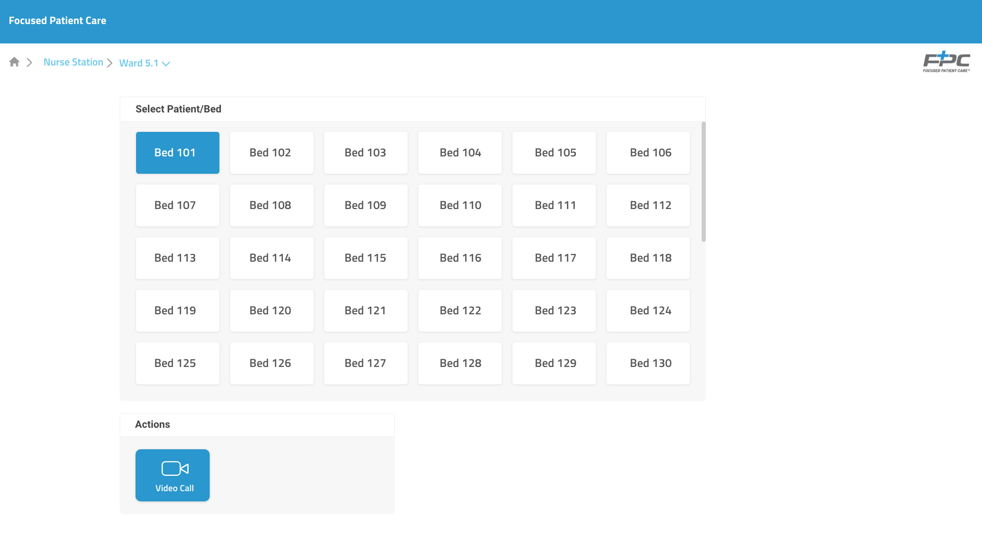
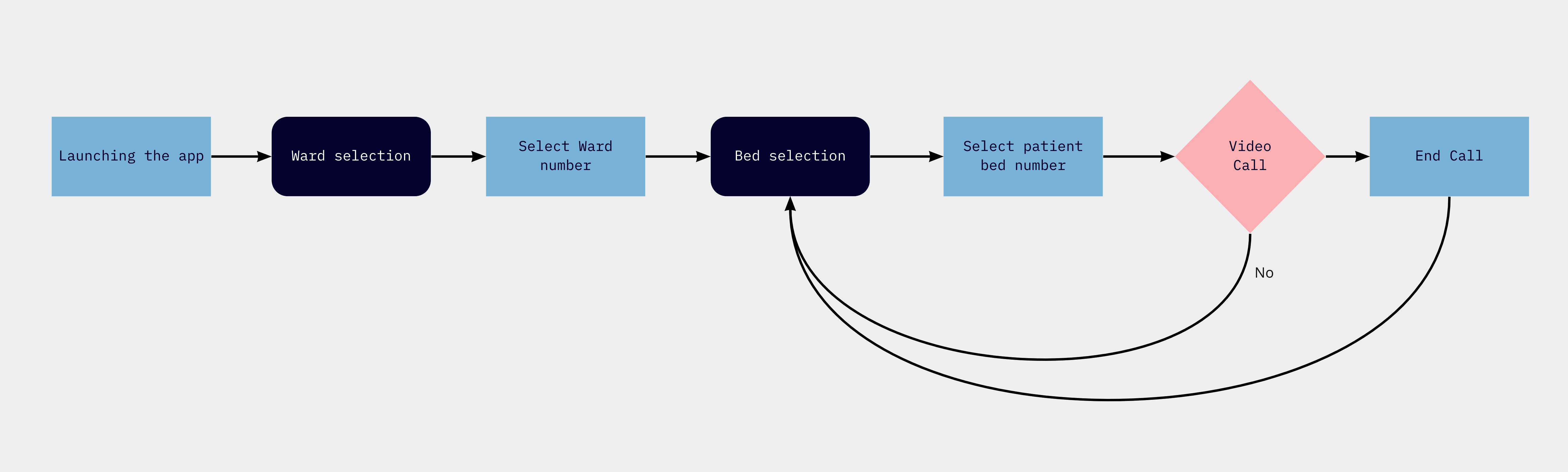
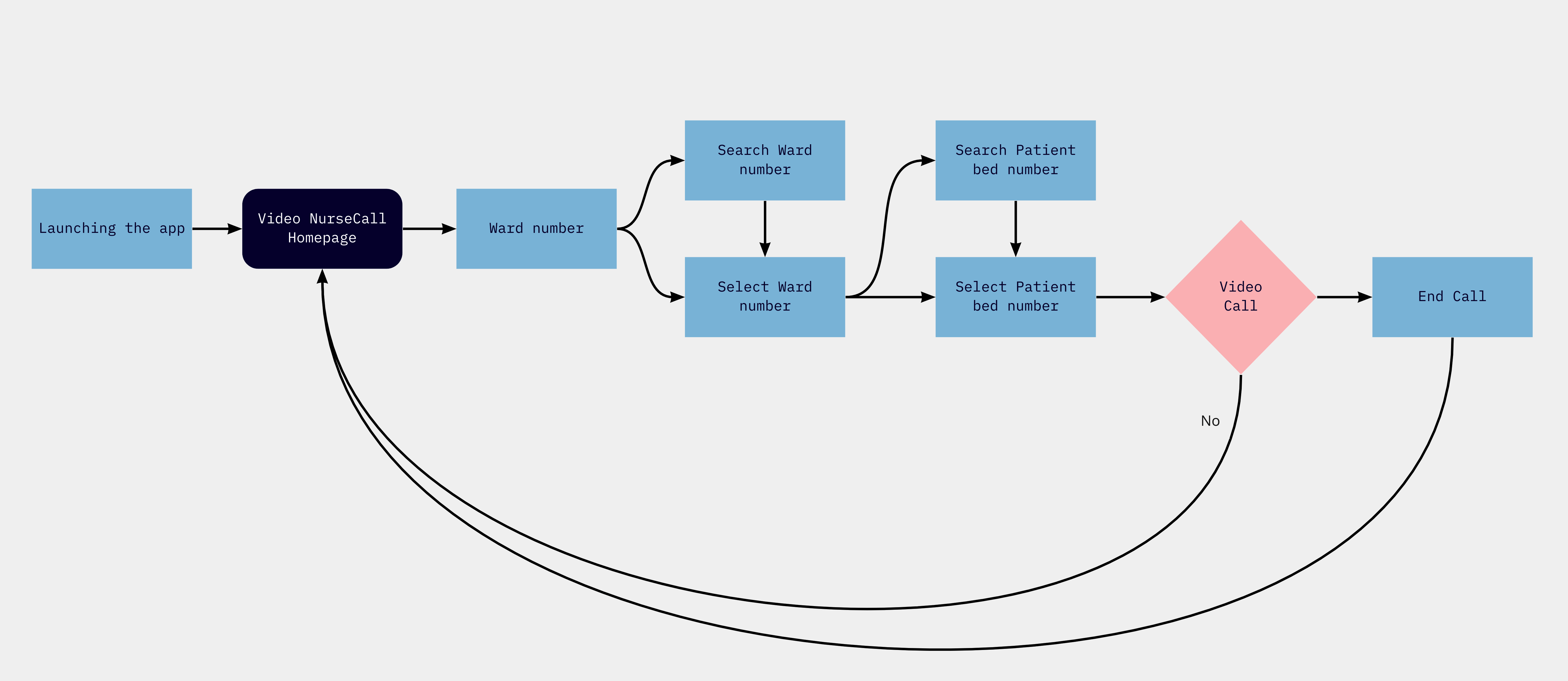
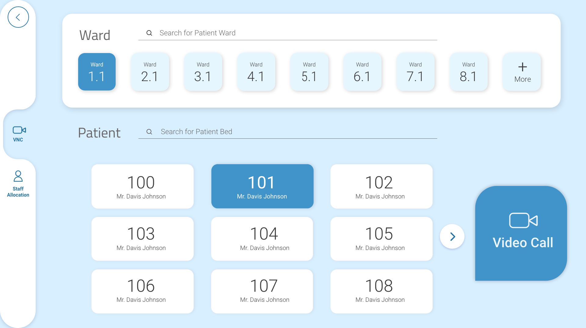
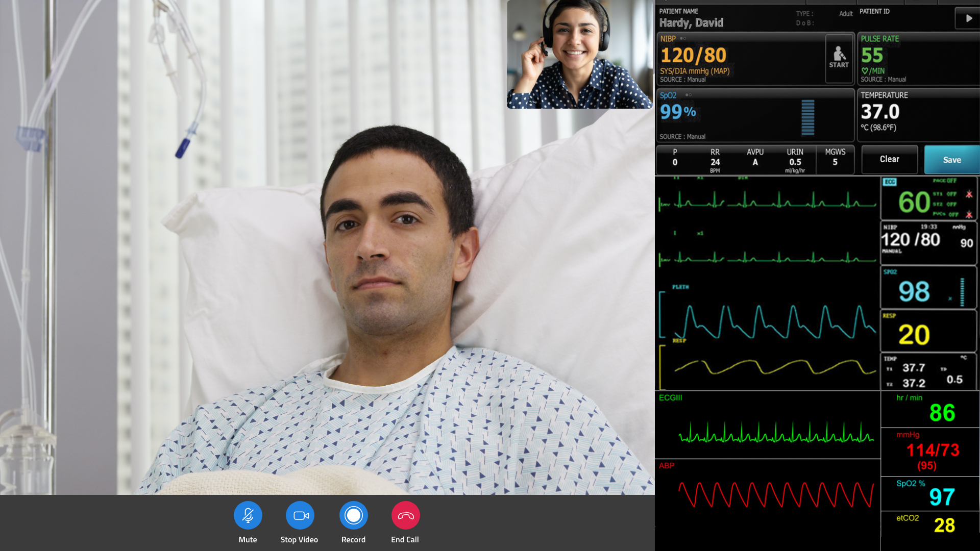
To improve the user experience of a solution that enables telehealth capability by which a patient can connect and do the video chat with the healthcare providers and vice versa at anytime by the bedside terminal while staying at the hospital. This way, a clinician does not have to visit the room every time when a patient activates NurseCall, thus supports the infection control.

Outcomes

During this Covid-19 pandemic, Video NurseCall System (VNC) becomes a leading solution to support infection control, because a nurse does not always have to visit the patient room in person when a Nurse Call is activated in the hospital. Rather, a nurse can have a video chat first and then go to the room based on the video chat.

Background

Rauland is a complete technology solution provider to communicate, connect and care for acute care providers/clinicians and aged care provider. 

The VNC application was already developed was running in the existing Rauland platform. The scope was basically to improve the existing user experience keeping the back end software architecture as it was. 

The Process

Step 1: Research & Discovery
(Collecting insights)

My first approach was to learn about the user flow and interactions of the existing VNC application, so that I can work on the UX without changing the basic structure. I also investigated about the goals, requirement and pinpoints throughout the journey of the existing flow of the application.

Pic: Screenshots of the old application

I mapped out the basic flow of the application for my better understanding

Pic: user flow of the old application

Key findings from research

  • Too many bed numbers for users to find the right one.
  • There could be any number of wards or beds in the page. 30 beds or wards can be shown in one page and it is not easy to locate a particular bed number if there are more than 30 beds in a page.
  • the operator in the Nurse Station does not need to select the Ward every time he/she wants to make video call, because the operator would be in charge of a single of few Wards. So, it is not efficient for an operator to go to the Ward selection page every time and select the same Ward to make a call.
  • An action button at the bottom is not always user friendly for the user.

Step2: Defining the minimum viable product (MVP)

  • A search section would be a great help to find either bed or the Ward numbers
  • Separate Ward selection page is a redundant.
  • Once the Ward is selected, the selection would be saved unless it is change

New user flow to improve the user experience

Pic: proposed user flow based on the MVP

Step3: Design solution and UI mockups

No separate page to select Ward number. Both the Ward and Bed numbers are at one page. So, there is one less page to go through. Beside, it gives more control to the user as user knows what happens when he/she selects the ward.

To find all the Ward numbers, the user just needs to click the “MORE” button and Ward section expands.

This is the design of the screen when video call takes place. The monitoring displays for the patient is still under concept stage.

Results

I received very good feedback from the product owner and also the stakeholders for the improvements that I did on the old design without changing a lot. Because, I had to be mindful about not changing a lot in the flow as the solution was already developed at the back end and the developers don’t have to spend a lot of time to develop the new design.

Small changes can bring big differences in the product. Things like adding search criteria for both the hospital Wards and patient Beds make users’ life a lot easier.

Limitations/ What is Next

  • This UI was designed aiming at the 10 inch Tablet screen and web screens. So the UI does not work on mobile screen. 
  • The Staff Allocation section does not work and was under concept area during that time
  • The final design was not tested by the operators of wards of the hospitals. 

Result (Prototype)

Let’s Connect
Get in touch to work together or just say hi!